Category Archives: Film reviews

Short reviews of films with a particular view to gaining insight into how the film was made and revealing useful ideas that can be applied to my own or others’ films.

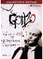
Gonzo: The Life and Work of Dr. Hunter S. Thompson | documentary 36 of 100

I wonder how many journalists became journalists because of Hunter S. Thompson? At the student newspaper when I was a journalism student at University of Montana, we’d spend hours debating his style late into the night, usually over beers. But the reality, I quickly discovered at my first newspaper job, is quite different. Journalists generally quietly support the status quo with stories that rarely challenge anything other than our ability to remain interested in what they have to say.

Synopsis: Few journalists have made a greater impact on their readers than Hunter S. Thompson, whose “gonzo journalism” defined a generation from the pages of The Rolling Stone. This film recounts that as well as his less well known life as father, a gun-lover, and a world-class celebrity who ultimately felt trapped by his own success, but who always followed his own eccentric path right up to his suicide in 2005.

Story Structure: Mostly linear and chronological story of his life, but with the frequently used device of beginning at his death, and then skipping back to the beginning, the progressing through his live to end the film at his spectacular funeral. I’m not sure how well this type of beginning works, actually – if there was something cliffhanger about his death, or something that was unexpected or in doubt, this approach would have worked better. But I suppose it’s better than just starting at the beginning – that’s even more predictable.

What I’m trying to say is: there’s nothing innovative about the way this film is structured – and it works just fine. It uses still photos, family film clips, tv news footage, and interviews with important figures like Jimmy Carter, Rolling Stones editor Jann Wenner, Pat Buchanan, and many others. The fact is, this film is exactly what it claims to be: the story of the life and work of Hunter S. Thompson. Nothing more, and nothing less.

Cinematography: Most of the film is a compilation. This is a classic “archival film.” But there are plenty of interviews, which are shot unremarkably in mostly natural light in the offices of the people being interviewed. But they get the job done nicely.

Editing: Editing was the big job on this film. How to pull all that archival footage together to tell a cohesive story? That’s the trick. And it’s done very well in this film. But without discernible innovation. One memorable edit: Thompson shoots his typewriter – which functions as a metaphor for him shooting himself. Great way to handle it.

Sound and Audio: There’s one really fun bit of audio accident that made it into the film: At one point during an interview with Pat Buchanan, an extremely loud Harley motorcycle blasts off outside the window where the interview is taking place. Buchanan pauses, laughs, and says “I think that’s perfectly fitting, isn’t it.” Music is all period songs from the likes of Lou Reed, James Brown, and Bob Dylan. Must have been a hefty price tag on getting all those clearances.

Nanook of the North | documentary 35 of 100

I decided to screen Nanook of the North for one reason: it was the first feature-length documentary film ever made. I didn’t expect to get much out of the screening, figuring it would be just a bunch of clips strung together predating the arrival of using the medium to tell stories. But I was wrong. In fact, as Robert Flaherty explains through heavy use of intertitles (the silent-film era’s way of explaining things), he in fact DID make a film of that kind, and was unsatisfied with the results, so he returned to visit the Eskimo people who live along the eastern shore of Hudson Bay to create a film with a story worth telling. And that’s exactly what he did.

Synopsis: Robert Flaherty spends more than a year filming one Eskimo family in northern Quebec, and introduces us to Eskimo life via their story. The family overcomes a series of hardships – lack of food, cold weather, dangerous ice – but Nanook, the “great hunter” saves the day.

Story Structure: This is much more than a simple “document” of life in the frozen north. It is a story structured as a series of life-threating obstacles which the family must overcome. Conflict comes from dramatizations of hunger, cold, and need to hunt animals to trade. The difficulty of life is sharply pictured, but at the same time a picture of a simple, solid family that lives in harmony with the Earth emerges.

Cinematography: The film opens with a tracking shot taken from a boat – moving past chunks of ice. It’s actually quite beautiful. One thing that struck me right away was the fact that this was filmed in extreme conditions! How surprising that the very first documentary film was shot somewhere so extreme. I would have thought someone would document something in their back yard first? So from the beginning, filmmaking has been about “the other world.”

There is also striking pathos in this film. For example, when Nanook harpoons a walrus, for a long time the walrus cries for its mate, which risks its own life to try and lock horns with the doomed walrus and help it to safety. It was a touching moment that spoke volumes about how close animals are to Eskimos and in fact how attached they are to one another and how brutal it is to kill them. An even more brutal scene occurs when Nanook traps a white fox, and straps it to his sled ALIVE, where the children pester it. You can’t help but feel terribly sorry for the creature, which is essentially being tortured before ultimately being killed.

Editing: There’s a lot more going on here than I would have expected for a film this early on. For example, the film opens with the entire family being disgorged from the mouth of a kayak that appears far too small for them all to fit into, which makes me think he was using some editing magic for comedic effect. Same thing in the scene where he harpoons a seal – which is followed by a lengthy scene in which he falls down repeatedly on the ice while waving madly for his friends to come help. This was almost certainly inspired by Charlie Chaplin, and totally staged.

One thing that surprised me is that this very first film contains animated maps. The animation is simple – just lines spreading out into the map to show the territory of the Eskimos. Nevertheless, animation as a storytelling device dates from the very beginning of documentary film. It’s clear that Flaherty wasn’t content to simply point his camera and document – he wanted to communicate and tell stories.

Music and sound: It’s simple, because there was no sound in those days. The music, though, is carefully cut or composed to match the on-screen action. For example, there’s a comical scene in which a trader plays a gramaphone for Nanook, who acts like he can’t figure out where the sound is coming from (also almost certainly staged). But the music interrupts to match the interrupted music on the screen, and so on. Also, plucking strings in the orchestra when Nanook is jigging for fish is nice tie-in. Essentially what was happening in those days was that the orchestra was matching their performance to what was happening on screen.

The Criterion Collection version, which I viewed, had an extras segment featuring an interview with Flaherty’s wife, who explained that Flaherty was “an explorer first and a filmmaker way after.” In fact, Flaherty was almost 40 years old when he made the film. Which gives me great confidence that 43 years old is not too late for me 🙂

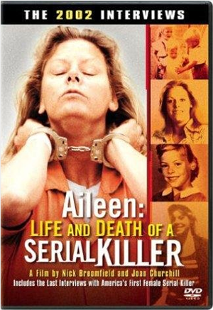
Aileen: Life and Death of a Serial Killer | documentary 34 of 100

OK I’m fully a third of the way into screening 100 docs. And one thing is clear: I’m most captivated by the small filmmaker teams, the people who manage to make film after film with just a couple of people. People like Werner Herzog, Marshall Curry, or Ross McElwee. Nick Broomfield and Joan Churchill are two filmmakers who have a long history of collaboration, with Nick often in front of the camera, which is run by Joan. But Broomfield is most known for being an early adopter of the “self-reflixive” style that would later be adopted with overwhelming box-office success by Michael Moore. For Broomfield, how the picture was made is part of making it, and he explains his thinking, questions, and includes the bits where he was wrong, which is part of the appeal.

Synopsis: In 1992, Broomfield and Churchill made a film about death-row inmate Aileen Wuornos, who was convicted of killing 6 men. In that film, she claimed she had killed in self-defense to avoid being raped. Broomfield picks up the story years later in this 2003 film, as Wuornos date with the death chamber looms, and makes some discoveries that call into question both his previous beliefs about Wuornos, call into question her sanity, and the fairness of the legal system.

Story Structure: Broomfield approaches his films the way an investigative reporter might approach a story – he patiently visits the people involved, gets them on camera filling in details, then he follows the trail wherever it takes him next. Along the way, he shares his thoughts, questions his earlier beliefs, and generally takes you along on the filmmaking experience, so that you are (often quite literally) looking over his shoulder the whole way. Broomfield actually takes the witness stand in the trial at one point, putting himself squarely in the middle of his film in a style that has been called Les Nouvelles Egotistes. Underlying the personal approach is roughly chronological storytelling – the film opens with him catching you up to speed on the details of the story, his own involvement with it, and ends with the execution of Wuornos.

Cinematography: Joan Churchill operates the camera, in a cinema verite style that is unremarkable but remarkably effective. She catches Broomfield putting mic on, has the camera rolling when prison guards ask if they have any hidden cameras as they enter the prison (to which Broomfield, without missing a beat, says “just that rather large one there.”)

Editing: One thing I noticed in this film, which made it feel more like TV journalism than film, was that names were occasionally beeped out and faces obscured.

Sound and Music: There was some fairly bad audio in the film, like planes flying over during interviews and such. Again, this all combines to make the film feel like a piece of TV journalism, rather than a “film.” As the film ended, we hear a song that Wuornos requested be played at her wake. As it was being played, the camera follows one of Wuornos friends to her home in Michigan. It seems obvious that the next scene will be the wake itself, with the actual audio. But it’s not. The film just ends. Which felt like a missed opportunity to me.

I’m seriously intrigued by this approach to storytelling. I don’t think I have the presence or desire to be “on” all the time while making a film, but I’m fascinated enough that I’d like to try it on a short film just to see what happens. There’s something magical about inviting people to share your thoughts while making a film the way Broomfield does. But this early in my career, my thoughts aren’t very coherent, so I’m not sure they’d be worth sharing. Yet.

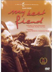
My Best Fiend | documentary 33 of 100

Against my better judgment, I am becoming a real Werner Herzog fan. Even though I find his megalomania and world view repulsive, there’s something deeply human and irresistible about his films. There’s an authenticity you don’t often find in filmmakers, a transcendent realness and willingness to invite you to share his thoughts. And I love that he makes films about the things that matter to him: in this case, Klaus Kinski, a German actor with whom Herzog made 5 films.

Synopsis: My Best Fiend is filmmaker Werner Herzog’s 1999 homage to actor Klaus Kinski who died in 1991. Herzog returns to the location of some of the films Kinski and he worked on together, and interviews actors and other people who worked with Kinski to paint a picture of a tortured genius. The film makes frequent use of clips from the films they worked on together, and details the frequent outbursts that colored their tumultuous working relationship.

Story Structure: The film is structured as a non-linear personal journey, in which Herzog makes use of archival footage, previous films, still photos and interviews to paint a portrait of Kinski in relationship with himself. In fact, the film doesn’t really tell us anything about Kinski beyond his relationship with Herzog, to the point where this film could be said to say more about Herzog than it does Kinski. Herzog and Kinski, it seems, were made for each other.

Cinematography: Straightforward style shot by single camera operator, Herzog’s dp, Peter Zeitlinger. Lots of shoulder mounted following shots during interviews, everything appearing to be naturally lit. The more memorable clips in the film cinematographically were pulls from the films Aguirre, the Wrath of God, and Fitzcarraldo.

Editing: Lots of long sequences cut together simply by Herzog’s editor, Joe Bini, who uses an unobtrusive, simple cutting style to link the interviews by showing supporting film clips while Herzog’s voiceover narration carries the story. I particularly like the choice of opening – a long sequence in which Kinski is playing Jesus, and you seriously don’t know whether he’s crazy and should be handcuffed by police, or applauded for his performance. It’s also disconcerting that there are no subtitles, so you don’t even know what is going on, which of course is the point.

Music and Audio: Herzog makes frequent use of chanting vocals, and my favorite place where he does that in this film is the Machu Pichu scenes, in which he’s describing the filming on Aguirre. Interviews are recorded with visible lav mics. And in an interesting and unusual twist for Herzog, what appear to be actors are used opposite his narration to translate what the other characters are saying in many scenes. This was a little awkward and hard to follow at first, but once I figured out what was going on, it worked.

I learned a lot more Herzog trivia from watching this film: did you know, for example, that one of the crewmembers working on Fitzcaraldo saved his life by sawing off his foot with a chainsaw? He had been bitten by a deadly poisonous snake, and after realizing he would be dead very soon, he sawed off his leg, thus saving his life.

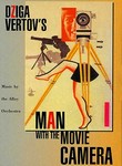
Man With A Movie Camera | documentary 32 of 100

Can a 1929 film made in Russia have anything to teach a beginning filmmaker today? That question was on my mind today when sat down to watch Dziga Vertov’s film, Man With A Movie Camera. The mere fact that you can instant-play the film on Netflix 81 years after it’s release is a clue. This film wasn’t simply trying to show life: its stated intent, shown in brief subtitles that occur mainly at the beginning of the film, is to create a language of film, a cinema without intertitles, without scenario (story), and without actors. In short, it was an act of film rebellion, very much in keeping with the rebellion that he was part of in the fledgling Soviet Union.

Synopsis: Dziga Vertov trains his mechanical eye on ordinary life, composing a visual symphony from a series of carefully paced sequences. A woman rising, streetcars passing, carriages riding down busy streets, athletes performing, audiences watching and many more scenes are explored in slow motion, fast motion, split screen, and superimposed sequences, techniques that are still in use today. Further, he includes himself (or another cameraman) as a character in the film, as the observer and participant in modern life.

Story Structure: Basically when is film is called “experimental,” that means it doesn’t have a traditional story. What that means in this film, is that it simply shows life unfolding in a series of tightly edited sequences, which are cut to music, not unlike Koyaanisqatsi and Baraka would be cut many years later. We see a range of human behavior, from waking up, to a funeral procession. An almost comedic sequence shows one couple signing a marriage contract, followed by an unhappy couple signing a divorce contract. The whole thing is strung together with numerous transportation sequences of trains, streetcars, horse-drawn carriages, and automobiles, on which the camera is sometimes mounted for tracking shots.

Cinematography: First revelation is that 1929 cameras were portable! That caught me by surprise. I always thought the first cameras were huge ponderous beasts that were virtually immobile, but not so. The man with the movie camera is everywhere in this film, with his boombox-sized camera mounted on a wooden tripod, slung comfortably over his shoulder. Lots of special in-cemra effects: for example, there’s lovely fast-motion sequences of clouds moving rapidly over a bridge. There’s a special effect in which people dissolve into a scene that is empty until the person dissolves into it. The film must have been at least a little scandalous in it’s day in filming topless women in mud baths. You get the sense that the filmmaker was very confident in pursuit of his images.

Editing: Split screen technique deployed to show man with camera towering over masses of people. Freeze frame action. There’s even the most basic kind of animation in this film, in a comical sequence that shows the film camera cranking itself and dancing, spider like, on its tripod legs. There’s even a pile of dead lobsters with one animated by hand crawling that’s quite freaky. We see pictures of Vertov’s wife editing the film, which are intercut with images of sewing machines, referencing the metaphor of editor as stitching together reality. The role of the filmmaker is ever present in this film. Rapid fire image sequences are at one point intercut with a blinking eye, cut with blinds opening and closing and finally the lens of the camera with it’s iris opening and closing.

Music and Sound: This of course was a silent film, but it’s not silent in that an orchestra would perform with the films of the day. The filmmaker left notes about how the score should be performed, and the version I saw noted that these notes were followed in the production. What we see a lot is that the musical score is fast and bubbly at times, in which editing matches the score (or vice versa). Other times it slows down, and the pace of visuals matches that. There are basic sound effects – such as a pan being hit every time a machine stamps out a widget.

What I learned about filmmaking from this film is that filmmakers have been pressing the limits of what a camera could do from the very beginning. And that the more filmmaking changes, the more it stays the same. Many of the techniques that we use today go back to the very beginning of filmmaking.

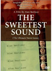
The Sweetest Sound | documentary 31 of 100

Alan Berliner is a name that keeps popping up in books about documentary film that I’m reading. So I finally decided to investigate the Berliner buzz by ordering a copy of The Sweetest Sound. Turns out there’s a lot to this name. Enough, in fact, to make a 60 minute documentary film. But what this film proves to me is that if you can make a film on this subject, you can make a film about anything. Whether it’s a film worth watching is less clear.

Synopsis: New York filmmaker Alan Berliner launches a personal investigation into the origins of his name with the help of his parents, people on the street, and 12 other Alan Berliners.

Story Structure: Structured as a personal essay, the film attempts to launch a story train with this line from the filmmaker: “when it comes to names, there’s no such thing as community property.” In essence, Berliner lays claim to the name and calls into question the right of other Alan Berliners to “his” name. He sets up a meeting with 12 other of them by flying them to New York and putting them up in hotel. However, there’s no specific challenge, or other “must see” reason to see what happens when the 12 of them meet. In fact, very little happens when they meet. They basically stand around talking as if they were at a Chamber of Commerce event. While it may be a flimsy story train, it is a train nevertheless, and Berliner  then uses interviews with people ranging from his parents to people in the street, to explore what Alan Berliner is all about. Maybe if my name was Alan Berliner, I would care. But it’s not.

This film strikes me as being made for TV, rather than as a film, at exactly 60 minutes in length. I think it would have made a much better 30-minute TV show, than a 60-minute one. That would have allowed for him to edit out the duplicated devices that were interesting once, but not after the 3rd or 4th time.

This film reminded me a lot of Ross McElwee, reflexive filmmaking. But it isn’t nearly as interesting as Sherman’s March. It’s problem, perhaps, lies less in its approach and more in its subject: which topic do YOU think is more inherently interesting: someone’s investigation of their name, or someone trying to find a girlfriend?

Cinematography: There’s one scene in this film that I’ve never seen done before, and I think works extremely well. It’s the last one in the film. The 13 Alan Berliners are all gathered around a round table, and they are having a toast. He put the camera on a lazy susan, and spun it very carefully to follow the glass clinking as it travels all the way around the room, until it ends up on the filmmaker, at which it suddenly stops. This rocked. He used the same technique earlier in the film, as a device to whip-pan through all the guests, to stop on a specific one at the point where that person begins talking.

There are lengthy narrated sequences in which we see circa 1999 websites being clicked and searched on. Perhaps this is interesting for one reason – it shows how badly the web sucked in the years prior to Google. But it’s a tiresome device.

I liked the way he filmed the his nieces, who were swinging. He put camera in front of them on sticks, locked off, with enough depth to keep everything in focus. Works.

Simple animation of name being written works, but it’s predictable after first use, and like many of the other elements in the film, he returns to it again and again. In fact, if there’s one take-home lesson for me from this film, it’s this: Use cool effects sparingly.

Editing: It felt like a 30 minute film edited to be 60 minutes. One innovative thing: He continues narration throughout credit roll. Haven’t heard that one before.

Music and Sound: I don’t recall any music in this film. But what I DO recall, in fact what I wish I could forget, is the never-ending mouse clicking and computer keyboard pressing that this filmmaker made use of. That device was cute for about 30 seconds, but it never ends. Another nice effect: sewing machine sound effect with tombs scrolling past rapid-fire.

While this isn’t one of my favorite films, I give Berliner major props for putting himself squarely in the middle of his films. That’s always a bold move: some people (me) aren’t going to like it. But for those with im the story resonates, it can resonate big time, and Berliner has had great success in getting his films screened at major film festivals and is widely perceived to be an “artist” filmmaker, with his work being recognized with a retrospectives of his films presented at the Museum of Modern Art (NYC). But for me, I’d take a movie theater over a museum as a showcase for my work any day.

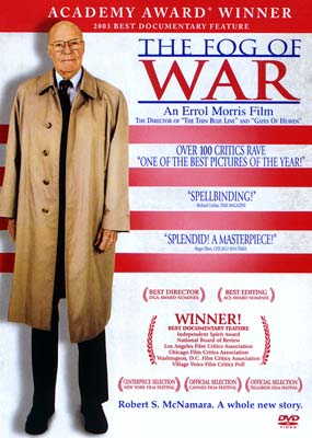
The Fog of War | documentary 28 of 100

In continued honor of editor Karen Schmeer, who was killed by a hit-and-run driver last weekend in New York, last night I screened The Fog of War, the most acclaimed film she worked on. I was surprised to see that she was one of three editors listed in the film, which is directed and produced by Errol Morris. Which leaves me curious why Morris uses more than one editor on many of his films. I did a little Googling and found an interview in which Morris explains how he went through half a dozen editors on this first film before he could find someone who could make a film out of his footage. Fog of War, though, began as TV series he ran briefly, called First Person, in which Morris interviewed interesting people for 30-minute episodes. He had the idea of inviting Robert McNamara, and the 30 minute interview was so good, that he knew it had to become a film.

Synopsis: Former Secretary of Defense Robert McNamara, widely regarded and reviled as the architect of policy that resulted in the Vietnam War, recounts the story of his life and muses on the lessons he’s learned about the limits of power.

Story Structure: The film is interview-driven, and structured around  11 lessons from McNamara’s life, which serve like chapters in a book to break the film into distinct parts, which loosely follow a chronology of his life. The classic elements of Morris filmmaking are all here: Penetrating eye contact with the interview subject, supported by news footage, historical photos, and occasionally the voice of Morris asking questions.

Cinematography: Memorable shooting/editing technique: This is the first time I’ve ever seen a sequence played in show motion, with fast-motion layer running over it simultaneously. The result is a dreamy state, a pause in the pace to reflect on the words that are being said, a disassociation with reality, stepping into another world. It’s a device used repeatedly throughout the film, and it’s killer. It was used when someone is flipping through pages of an open book, and also to show people walking down a street. He uses it again to show the Vietnam Memorial – with people lingering in slow motion while people rush past at a fainter percentage of visibility. It’s a beautiful technique that I’m totally going to borrow and build on in my own work.

There’s a memorable scene which plays forwards and later in the film backwards, which shows dominoes falling across a map of the world. This is of course a reference to communism taking over the globe, the rationale for getting deeper involved in Vietnam. It’s shot at a high frame rate, and played in silky slow motion. The b-roll of tape recorders (with shallow depth of field) is also shot in slow motion, looks really beautiful, and works against the tape recordings it’s paired with.

The film is wrapped up with a series of shots of McNamara driving in his car through rain-soaked streets. It’s beautifully shot: close up on his glasses reflecting trees passing by, but with his eyeball huge; top of his head and rain-dropped window above. It reminded me a little of the driving scenes of Al Gore in Inconvenient Truth, only Gore as a passenger in those. The fact that McNama is driving himself seems to portray how his time and come and passed.

Editing: What’s different about this film from most Morris films, and mildly disconcerting, is the amount of jump cutting. I’m pretty sure it was included for a reason: to show how difficult it was to get McNamara to answer in complete sentences, and to show how much he attempted to steer the conversation.

An interesting editing technique (which might more probably be called an animation or special effect technique) was a shot in which the camera floats down a column of falling bombs (animated, presumably, but begins with a still B&W photo and it’s like we can travel into the photo, and down among the bombs, which drift past us as we continue down into them. It’s way more powerful than the typical zoom and pan on photographs for it’s impact to draw you in.

Playing things backwards is also a recurring device used in this film to show that things we thought happened actually didn’t. For example, the torpedo boats that supposedly attacked US warships in Vietnam, and were the inciting incident for massive bombing by the US, in fact never happened.

The film ends with a powerful line delivered by McNamara, who is quoting TS Elliot:

We shall not cease from exploration
And the end of all our exploring
Will be to arrive where we started
And know the place for the first time.

Music and Sound: Philip Glass again provides the soundtrack for the entire film, as he does on previous films like Thin Blue Line. My main critique is that if you’ve heard one Glass soundtrack, you’ve heard them all. The music is almost invisible to me in the film, and maybe that’s why Morris keeps returning to this composer, to keep the attention on the subjects with as much force as his Interrotron.

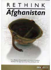
Rethink Afghanistan | documentary 27 of 100

The first thing I noticed about Robert Greenwald’s filmmaking in Rethink Afghanistan is how seriously he cut corners to make the film. For example, seconds into the film, the image quality takes a huge hit as we watch footage he must have pulled off YouTube. Soon after that is an interview that sounds like it was recorded in an echo chamber, the result of inexcusably sloppy audio work. So, is it any surprise that the second thing I thought was: if he cuts corners this seriously in production, with what care does he handle the facts?  I’m sympathetic with the primary charge he levels with this film: that this war is having in many cases the opposite effect from the story we tell ourselves. But there’s something off about a filmmaker who’s in such a rush to make a film that he can’t move the microphone a little close to the subject’s mouth to get a clear recording.

Synopsis: In a rapid-fire sequence of interviews, news footage, and photos, Greenwald lays out evidence for the case that the United States is making a huge foreign policy mistake by pursuing the war in Afghanistan, and in fact, making the situation there worse.

Story Structure: The film is breathlessly structured around a series of “myths,” which are each quickly brushed aside by a fast-moving parade of interviews and other evidence. For example: “Women are better off in Afghanistan now that the US has removed the Taliban.” Cut to photo of a woman whose face has been eaten away by acid splashed on her by Taliban for showing her face in public. Cut to interview of an Afghan woman saying she fondly remembers the Taliban days, because at least they could stay inside and be safe. Cut to an academic talking about how women are bearing the brunt of violence in the war. The only thing we never cut to is someone acknowledging anything other than horror. Come on, there’s NOTHING good about the Taliban being gone? I’d be more likely to believe his evidence if he at least acknowledged some of the upside. There are so many fast-moving facts, that it seems, there’s no time to even acknowledge other points of view.

Cinematography: Bad. The interviews have no consistency between the way they were shot and lit and many have appalling audio. In fact, it was difficult for me to tell from watching the film whether the filmmaker was actually IN Afghanistan at any point in the filmmaking – it feels like the whole thing is stitched together from news footage and photographs, and interviews that could have been made just about anywhere. Because the quality of the footage varies so greatly, it feels like it was all found somewhere rather than being shot for the film specifically. To give some credit, the b-roll does support the things the interviewee is talking about, often very literally, rather than with much finesse.

Editing: The pacing of this film is way, way too fast. I found myself holding my breath at times, because I thought I was drowning in facts. Facts that I didn’t even have time to question in my own head before new facts were trotted out as further evidence, which are in turn replaced with further, different facts. Makes you crazy after awhile.

Music and Sound: One sound effect I liked is the “swoosh” sound effect that accompanies the flash transition used in the film. The music is in the background adding to the relentless rush of the film.

Bottom line: While I appreciate the filmmaker’s intentions, this film is what low-budget journalism would look like if it didn’t have to drag the burden of fairness around. By slowing down, doing a better job in production, and at least acknowledging the existence of alternative points of view, this could have been a much better film.

Lemonade | documentary 26 of 100

Seth Godin did something he doesn’t usually do earlier this week: he raved in his blog about a documentary film. “The Lemonade movie is so professional, engaging and inspiring that you’ve probably already seen it. If not, here it is.” I wish it were true that possessing those qualities made it probable that a film would find an audience. If so, there would be as many people crowding into theaters to watch The Cove (my Oscar pick for best doc) as there are lining up to see Avatar. But that’s another story.

Synopsis: Devastated when they are laid off from their ad agency jobs, former employees tell how they found courage and means to turn their perceived misfortunes into golden opportunities to create businesses that better reflect who they are and how they want to live.

Story Structure: Interviews are the spine of the film, which are structured in three acts: 1. Laid off – oh crap. 2. What am I going to do about it? The characters reach a point where they decide to take matters into their own hands. 3. As a result, they find happiness and inspire others.

This structure, incidentally, is essentially the same structure of our film Shine, except that our first act was people leaving by choice, because they hated their jobs.

Cinematography: One word: stunning. These are some of the most beautifully lit and shot interviews I’ve ever seen in a film. The production values were very high, from gorgeous introduction sequence with lemons bouncing around shot at a high frame rate and rendered in silky slow motion, to the detail shots of characters hands, to the sparse but stunningly beautiful b-roll from the lives of the characters. Who are mostly all beautiful. Most everyone is fairly young, too. It looks like the film was produced by an ad agency. Oh wait, it was! Ha ha. They did a great job applying their skills to the task, and the result is an effective sales pitch for DIY career management that looks like an ad for a BMW.

It had to have been shot on a Red Camera or maybe just a Canon 5d. Something with one hell of a fat sensor, because the depth of field is so shallow, they had a hard time keeping the interview subjects in focus – if they leaned forward to make a point, even an inch, they were out of focus. It’s the kind of cinematography that I call “shallow depth of field porn.” One thing about lighting: it appeared to be relatively simple soft source key, without any rim light. There was always darkness surrounding the interviewee for drama, but light in background to set them off the background, which was carefully exposed just right so the highlights were never completely blown out. The background light often has a soft color to it – the orange of a lampshade for example.

The b-roll was often very small things, details: hands fidgeting, lots of focus pulling, limbs cartwheeling through yoga class, coffee beans that looked good enough to eat, milk being poured into coffee as if it were a Starbucks commercial, veggies being chopped. Still photos were jump-zoomed into like you see on network TV – from small to medium to big in three distinct steps, rather than zoomed steadily into, which is the more filmic way. They even found a way to use the side angle of the interviewee’s face as b-roll, cutting to shots of person just looking at camera while their voiceover continues. It all adds up to make them larger than life, heros.

Editing: Spare use of b-roll to accompany the interviews, which are shot so beautifully that I’m glad they stayed on the faces as long as they did. An interesting departure was no slates for any of the characters. Instead, at the end of the film they all state their names and we cut through all of them, sort of like all the performers take a bow at the end of a play. The recurring use of lemons worked but felt a little overdone, but they look so good you can’t help but but enjoy watching them roll by in slow motion or get chopped up or just glide by. Editing did a great job of intercutting the different characters so that they are all talking about the same thing, moving the story forward together by completing each other’s sentences almost.

Music and Audio: Music (credited to Caspian) is mostly quiet guitar riffs build the mood. Soft, sparkly keyboard riffs.

A lot of talented people worked on this film, and it shows. Bravo for an inspiring film that raises the bar on what documentaries of this kind can look like: gorgeous.

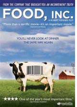
Food, Inc. | documentary 25 of 100

Well tomorrow’s a big day for a select group of documentary filmmakers – the official Oscar nominations will be announced tomorrow morning at 5:38 am Pacific. I wasn’t planning to be awake for that. But tonight after screening one of the films in contention, Food, Inc., I’m not sure I’ll be able to get to sleep at all. Don’t watch this film if you aren’t prepared to change your eating habits. This film won’t necessarily make you a vegetarian, but it will send you to the free-range, organic isle for life. See you there.

Synopsis: Think that FDA stamp of approval means your steak is good? Think again. Filmmaker Robert Kenner teams up with two investigative journalist authors, Eric Schlosser and Michael Pollan, to uncover the ugly truth: faceless megacorporations have taken over the food chain. If you’re a carnivore, you might be thinking soybeans … until you learn that one company is forcing virtually all farmers in America to plant its genetically modified beans. Despite the grim reality, this is a hopeful film, reminding us that as bad as it is, Big Tobacco was until recently in the same place is Big Food is today.

Story Structure: The opening sequence of this film is my favorite ever. Not only does it surprise and delight, but it makes a subtle comment about labels on food in general: we think we have a cornucopia of choices, but we really don’t. In fact, we hardly see brands and labels at all, not realizing that just a small handful of companies are delivering most everything on the isles. And what they are delivering leaves something to be desired. But I digress. The story is narrated by the two authors who the filmmaker teams up with to make the film: a pair of investigative journalists, who we return to over and over in the film to regain our bearings in an otherwise dizzy array of facts. The film makes use of everything from home movies of a boy who died from an e-coli outbreak, to interviews, to news footage, to hidden camera footage shot by employees of one of the 6 meat packing plants that server the entire USA.

Cinematography: This was a tough film to shoot, because the big food companies don’t like it very much when filmmakers look below the surface of their expensive logos and pr departments. That means we’re treated to fly-overs and drive-bys of feed lots, more often than the thing itself. Which make them a lot prettier than they really are. The filmmakers are a lot more polite than Michael Moore would have been in gathering footage, but they do manage to get meat packing plant employees to carry a hidden camera that reveals a tiny slice of the horrors awaiting pigs, chickens, and Mexicans who manage to avoid being captured by the INS long enough to work in these pits. In one memorable scene I spotted a LitePanel sitting on the dash of a pickup truck driven by a farmer who ends up not allowing filmmakers to film his chickens. At least his face was beautifully lit while he caved to the man.

Editing: The rotating business card animation is my take-away editing trick from this film. It’s that thing otherwise known as “revolving door” in which lobbyists and industry big-wigs get plumb government jobs in between commercial gigs. If they were your friend, you’d have a hard time remembering which email address to use to invite them to your daughter’s graduation. Or funeral.

Music and Sound: The got “The Boss” to chip in a song at the end. What more do you want.