Sound for Film and Television review

I chose to skip film school and get straight to making documentaries of my own. But that doesn’t mean I’m skipping filmmaking education. I’m opting to learn by reading, by doing, and by watching great instructional materials like Sound for Film and Television. This 2.5-hour film by location sound professionals Barry Green, David Jimerson and Matt Gettemeier can be summed up in 2 words: audio bootcamp.

Whether you know nothing about recording location sound for your films or are working on your second documentary, as I am, you will learn something from this DVD. What’s more, you’ll enjoy learning it, as Jimmerson and crew put a lot of effort into making the sections entertaining as well as informative. There are just two hugely important techniques that will solve 80 percent of your location audio problems, and you’ll learn them in the first few minutes of the DVD. Then you’ll have them repeatedly drilled into your head through the rest of the film, so that by the time you reach the end, you know exactly what it takes to get great audio on your next film.

Topics include:

  • Avoiding common mistakes
  • How to choose the right mic for interior vs. exterior shooting
  • How to use a boom pole
  • Sound kit basics
  • Choosing great locations

Key takeaways for me:

  • When recording dialogue, a good recording level is -20db to -12db; never higher than -6db.
  • Octava MK-012 mic is an excellent, inexpensive mic for interior booming.
  • A hypercardiod is the best type of mic for interior booming.
  • Countryman B-6 is a good tiny lav that’s easy to hide.
  • Avoid clipping at all costs – it destroys the audio usability. Better to keep levels too low than too high (same is true of video highlights)
  • In typical video situations, you can split the signal so you’re recording two levels simultaneously, one lower than the main. If a spike happens, you can substitute the other channel in post
  • Hardwood floors, parallel walls, tile floors, open glass windows – all are warning signs that bad audio may result.
  • Odd angled walls, carpeted floors, soft furniture, window treatments such as drapes – all good signs that place is good audio environment.
  • Listen to the sound of a room through over-ear earphones before recording. You’ll pick up tiny details like refrigerator hum, and can correct it before beginning to record.
  • Always record 30 seconds of room tone without any other sound, for use in post.

    My only critique of the film is that it’s all about narrative film, and some of the techniques describe overlook the fact that as documentary filmmakers, we can’t always control the set. But ultimately the techniques are the same, and there is a good deal of time spent in this film on how to get the best sound from lav mics, which is what I use all the time (they recommend not using them for narrative work, which I agree with – but they’ll save your ass on docs).

    If you’re considering making a documentary and don’t have experience recording audio beyond what your camcorder can do, this film is required and enjoyable viewing.

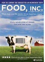
    Food, Inc. | documentary 25 of 100

    Well tomorrow’s a big day for a select group of documentary filmmakers – the official Oscar nominations will be announced tomorrow morning at 5:38 am Pacific. I wasn’t planning to be awake for that. But tonight after screening one of the films in contention, Food, Inc., I’m not sure I’ll be able to get to sleep at all. Don’t watch this film if you aren’t prepared to change your eating habits. This film won’t necessarily make you a vegetarian, but it will send you to the free-range, organic isle for life. See you there.

    Synopsis: Think that FDA stamp of approval means your steak is good? Think again. Filmmaker Robert Kenner teams up with two investigative journalist authors, Eric Schlosser and Michael Pollan, to uncover the ugly truth: faceless megacorporations have taken over the food chain. If you’re a carnivore, you might be thinking soybeans … until you learn that one company is forcing virtually all farmers in America to plant its genetically modified beans. Despite the grim reality, this is a hopeful film, reminding us that as bad as it is, Big Tobacco was until recently in the same place is Big Food is today.

    Story Structure: The opening sequence of this film is my favorite ever. Not only does it surprise and delight, but it makes a subtle comment about labels on food in general: we think we have a cornucopia of choices, but we really don’t. In fact, we hardly see brands and labels at all, not realizing that just a small handful of companies are delivering most everything on the isles. And what they are delivering leaves something to be desired. But I digress. The story is narrated by the two authors who the filmmaker teams up with to make the film: a pair of investigative journalists, who we return to over and over in the film to regain our bearings in an otherwise dizzy array of facts. The film makes use of everything from home movies of a boy who died from an e-coli outbreak, to interviews, to news footage, to hidden camera footage shot by employees of one of the 6 meat packing plants that server the entire USA.

    Cinematography: This was a tough film to shoot, because the big food companies don’t like it very much when filmmakers look below the surface of their expensive logos and pr departments. That means we’re treated to fly-overs and drive-bys of feed lots, more often than the thing itself. Which make them a lot prettier than they really are. The filmmakers are a lot more polite than Michael Moore would have been in gathering footage, but they do manage to get meat packing plant employees to carry a hidden camera that reveals a tiny slice of the horrors awaiting pigs, chickens, and Mexicans who manage to avoid being captured by the INS long enough to work in these pits. In one memorable scene I spotted a LitePanel sitting on the dash of a pickup truck driven by a farmer who ends up not allowing filmmakers to film his chickens. At least his face was beautifully lit while he caved to the man.

    Editing: The rotating business card animation is my take-away editing trick from this film. It’s that thing otherwise known as “revolving door” in which lobbyists and industry big-wigs get plumb government jobs in between commercial gigs. If they were your friend, you’d have a hard time remembering which email address to use to invite them to your daughter’s graduation. Or funeral.

    Music and Sound: The got “The Boss” to chip in a song at the end. What more do you want.

    Fast, Cheap and Out of Control | documentary 24 of 100

    New York-based documentary film editor Karen Schmeer was tragically killed this weekend by a hit and run driver. In honor of the Academy Award-winning editor, a frequent collaborator with Errol Morris, I’m going to screen her recent films, beginning with the 1997 documentary Fast Cheap and Out of Control. IndieWire blogger Matt Dentler calls that film “one of the best jobs of editing a documentary, I’ve ever seen.” Hmmm. Here’s how I see it…

    Synopsis: What happens when Error Morris puts a mole-rat specialist, a topiary gardener, a lion-tamer, and an MIT robot scientist under the lights of his Interrotron? You get a mashup called Fast, Cheap and Out of Control. You get to try and make sense of deep philosophical statements like “You’re either prey, an enemy, or ignored,” never sure whether this is a joke, reality, academia, or the circus. Mostly, it’s the latter.

    Story Structure: It’s difficult to say that this film actually has a structure, but I think it’s in there somewhere. Let me try to make sense of it: you’ve got four main characters, who are the rocks of the film to which the barnacles of story cling. Desperately.

    Cinematography: There are a lot of solid individual shots in this film. For example, the Hollywood lighting on the giraffe topiary, complete with smoke machine and fake rain at night. Ohhhhhhhh. Ok so that’s pretty. Pretty chaotic. Cut to the middle of a B&W chase scene from a 1950s sci-fi film in which the preying mantis is about to own your ass. Lots of slow-motion, color suddenly changing to black and white, camera angles titled diagonally, as if to scream: the world is not as it appears. YOU’RE DREAMING. Or Crazy. Or the filmmakers know a LOT more about what they’re doing than you do. Or something like that.

    Editing: There’s no doubt that this film was a bitch to edit. If I can’t make sense of it as a viewer, imagine how the editor must have felt having to try and make sense of it? But the reality is: it’s a watchable film. It’s just difficult if you try to understand it. So don’t. I really liked the occasional flashbulb transition. Those were really cool looking.

    Sound and Music: The music works. I found myself wondering whether it was composed AFTER the editing, or BEFORE. The music was composed specifically for the film, according to the credit roll, so maybe it was a collaboration. Music is a very big part of this film, providing a pulse for the journey. There are moments, such as when animated characters appear onscreen, that appear almost Disney-like with the matching of music to character’s tumbles.

    Bells From the Deep | documentary 23 of 100

    To really grasp the significance of story in documentary film, it helps to screen a film that doesn’t have a traditional story thread. Bells From the Deep: Faith and Superstition in Russia by Werner Herzog is unique among the docs I’ve screened so far in that it is more observational than storytelling. It is a “documentary” in the literal sense, a series of brief snapshots, of undeveloped characters. Herzog, it seems, was curious about the topic of mysticism in Russia, and chose to explore them with his camera. The result is an interesting, obscure film that hardly anyone’s heard of (you can view the hour-long film for free instantly here).

    Synopsis: Herzog visits Russia to explore the topic of mystical spirituality, and finds Jesus look-alikes, Rasputin doubles, and a Siberian shaman, among others. The film is composed of mostly short vignettes: a baby being baptized, a Jesus-figure visiting disabled people, and a faith-healer working a packed crowd. It’s most lengthy segment deals with the legend of the lost city of Kitezh.

    Story Structure: The film is a non-linear series of snippets separated by chapter titles, which are white text against light blue screen. Only structure is provided by Herzog’s voice translating the Russian into English. He provides no narration, though, and it struck me that this film isn’t really terribly different from “Encounters at the End of the World.” Except for one thing: narration. In Encounters, Herzog imposes a story on an otherwise random series of encounters with narration, historical footage, interviews, etc. But there is no “story” in and of itself. Fascinating.

    Also fascinating is the controversy surrounding this film. It turns out that no pilgrims were on the ice during Herzog’s visit to Kitezh. So he hired two drunks from the next town, and one of them promptly passed out on the lake, as if he were lost in meditation. Herzog freely admits the fabrication, because for him, it represents a higher truth, what he calls “ecstatic truth.”

    Cinematography: It’s beautifully shot. Lots of lengthy sequences with few cuts. Memorable scenes: Herzog opens the film in Siberia, by walking into a Shaman’s cabin. Beautiful shots of throat singers are filmed simply against a piercingly blue, ice-choked river backdrop. Stunning, really.

    Sound and Music: I now know where Herzog first discovered the incredible Orthodox chanting music he used for the under-the-ice sequences in Encounters. He uses the exact same cut in this film! It’s good in this film, but much better in Encounters.

    Herzog translates into English, but provides no other narration, which strikes me as a weakness of the film. It feels unfinished by comparison with his more recent work. Narration could have provided the missing link that made this film something other than an interesting oddity.

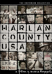
    Harlan County, USA | documentary 22 of 100

    It’s doubtful that Harlan County, USA, is on any tourist guidebook “must visit” lists today. And it certainly wasn’t in 1973, when Barbara Koppel was making this classic social documentary about the struggles of striking coal miners. Just watching the footage, with its Southern drawl, red necks and decaying teeth made me want to move back to Canada. But I stayed in my chair. And I admire Koppel for staying in Harlan County for the years it took to make this important film, and glad she found gold under all that coal when she won an Academy Award when the film was released in 1976.

    Synopsis: Striking union coal miners in rural Kentucky go head-to-head with Duke Power and its “gun thugs” in a lengthy strike that leaves one miner dead. The film illustrations the conditions that miners worked under in the mid-70s, which caused many to suffer black lung and die in mine accidents, and their struggle for decent wages and working conditions. The film, made by Barbara Koppel, also documents the active role played by the miner’s wives in support of the strike. Violent clashes on the picket lines are recorded by filmmakers as well as messy power struggles within the labor union leadership that ultimately leave miners feeling alone in their struggle.

    Story structure: Story roughly begins with the strike, follows events during the strike, and concludes when miners signing contract that was less than what many wanted.  But along the way, we take many sidebar trips into understanding conditions miners work under, view historical footage of famous mine disasters in the region and meet survivors and relatives who give interviews, and learn about labor politics. It seems the filmmakers set out to make us want to care about the plight of the miners BEFORE it portrayed them as being on strike – and they spend considerable amount of time in beginning of film doing that before we learn they are on strike. Probably chose that approach because of knee-jerk reaction many American’s have against organized labor. There’s no satisfying conclusion to the film, though, when the strike ends: the miners seem resigned to repeating this struggle over and over again.

    Cinematography: I’m still wondering how the filmmakers got permission to film in the mine – perhaps the shots that open the film of the miners leaping onto conveyor belts that take them deep into the mine were shot after the strike ended and they returned to work, in non-linear sequence. But I’m still surprised that Duke Power would allow them to film the miners afterward. In any case, the fact they were able to film in the mines is an achievement. Without it, the film wouldn’t have had the same “there but for the grace of god go I” feel.

    Because they lived with the affected people over a period of more than a year, they got intimate access which is what’s remarkable about the otherwise unremarkable cinematography in the film. Simply being able to be there with a camera when the grandmother collapses on seeing her grandson’s open casket, for example, is so powerful. The cinematography is very journalistic, but one memorable artistic moment is the shot of miners silhouetted around the barrel fires on the picket lines. Some of the shooting was also quite brave: there’s moments where gun thugs approach the camera menacingly, and you hear Barbara’s voice off-camera talking to them, sounding quite confident and sure of herself.

    Editing: The film was cut together using a combination of interviews, archival and news footage, photos, and cinema verite shooting. There’s one very plain textual graphic device used in the film to convey info very effectively: using 3 lines of simple white text over a shot of the mine, the first line shows the percentage increase of Duke Power’s profits. Second line shows miners wages increase. Third line shows cost of living increase. We see that the miners are making less than cost of living increase, while profits were up 170 percent. Very effective; no animation required, just these numbers presented cleanly.

    Music and Sound: Since the union miners have a rich tradition of singing, why not use that as the soundtrack of the film? It’s the obvious choice. And sometimes the obvious choice is the best choice. It certainly is very effective in this film. Early in the film we hear a coal mining song being sung in background over shots of mining life. Then we cut to a guy who looks like the face of death, rocking on his porch and we realize he’s actually the guy singing. Nice way to bring the soundtrack to life, and as it turns out, transition into an interview with the man about what it was like for him to work in the mines.

    A lot of the tracks are purely vocal, sung without musical accompaniment. Some include banjo picking. All contribute to the ambience of the place as being low education, low opportunity, but big hearted and real.

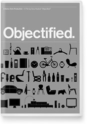
    Objectified | documentary 21 of 100

    When I stop and think about it, Objectified is the film that made me want to be a filmmaker. I first saw this extraordinary film last summer at Northwest Film Forum. This film spoke to me where I was at at the time: in the middle of making a “talkumentary,” and wondering how the hell can you make interviews interesting? This film is one lovingly crafted answer. Gary Hustwit gave me something to aspire to. Like the objects it portrays, it’s a work of art. I purchased the DVD last week so I could screen it again, and it’s a reference I plan to return to a lot. It’s that good.

    Granted, if you’re not a design lover, you might not love this film the way I do. It does appear aimed at a specific audience – people who are predisposed to own Apple products, BMWs or designer furniture. But thanks to Target and Ikea, this audience is bigger than ever. And I take it as an article of faith that this type of film will be made more and more in the future, as audiences become even more niche, and filmmakers aren’t afraid to do what Hustwit did – start his own distribution company (Plexifilm) to reach them. Bravo for stepping out of the mainstream to make something remarkable for those of us who can appreciate it.

    Synopsis: Objectified takes a reverent look at the well-designed things in our lives through the eyes of the people who design them. Seamlessly stringing together interviews with industrial designers like Jonathan Ive (iPhone), Karim Rashid and Marc Newson, it is a pean to the clever men and women who turn cell phones and kitchen chairs into objects of desire.

    Story Structure: This film is more a meditation than it is a story. It’s more poetry than it is narrative. And it’s proof that – at least for someone interested in the topic – you don’t have to launch a story train to keep an audience’s attention: you just have to pick a visually compelling topic, get access to its most famous and well-spoken practitioners, come up with a clever way to link the interviews (more on that below) and have a lot of frequent flyer miles.

    Cinematography: I especially liked how the interviews were set up. They appear to be all natural light, but a few are not – I could tell that a nice big softbox or other very soft source of light was often used to bring up the faces of the interviews against the white walls that they are often shot against. But most of them are lit with available light, most often window light, frequently with white walls as a background (or possibly against a white backdrop) that are rendered light grey in the exposure. Where possible, interviews were shot with the designer’s workspace as the background, or in designer’s home surrounded by their favorite objects.

    The interviews are intercut with many details shots (taken at same time as interview) with subject handling their favorite objects (ie, Ive turning a mac on, closing the lid, playing with milled metal).

    Interviews are always shot on sticks, but usually fluid – with camera operator following the movement of the person gently to keep them filling the frame. Lots of reframing is hidden by b-roll, but we get nice series of wide, medium and close shots for most of the subjects to keep it visually interesting. And clearly, a lot of attention was paid to the backgrounds.

    B-roll is simple and beautiful. For example, to get into the Target interview, we have a brief sequence of shoppers at Target, which ends with a shot of an idle checkout machine at Target on which the Target logo is bouncing around the screen in screesaver mode. And when we’re hearing from the car guy, we see this intimate very extreme telephoto shot looking right into people’s cars at their faces as they drive by (you can bet they didn’t get releases for those shots, yet another reminder that releases are NOT always necessary for docs).

    The use of slightly slow motion is visually interesting, and at first I didn’t even notice that it WAS slow. But it is – no more than 50 percent, possible just slowed 25 percent, but enough to really render beautiful the crowd scenes of people walking while talking on their cell phones, etc.

    I noticed that some of the interviews broke the convention of having the interviewee look between the camera and the key light source. Reminder that if it looks good, it’s OK if it doesn’t follow convention.

    There’s not a lot of fancy camera movement in the film. Just a couple scenes come to mind, when there’s a twisting camera pan into a trash bin, and another tilt shot revealing how much trash there is in the bin by traveling from bottom to top slowly. Like the best design, the camera work in this film is a reminder that less is often more.

    Editing: The pacing and rhythm of this film is magnificent. It opens with the sound of an assembly line robotic machine, which after a few seconds of black, fades up to reveal the machine at work in a series of locked off shots, in which all the motion comes from the machine’s movement. We hear Jonathan Ive’s voiceover, speaking reverentially. We feel that we are witnessing creation. The camera doesn’t budge until later in the sequence, when the pace picks up, and the camera finally begin to move with the machine as the music picks up the pace. Fucking brilliant editing and shooting, that.

    Another thing I noticed: At critical points in interviews, there’s an edited pause in which an object which is being discussed is shown, to give us time to look at it for a few seconds, before the dialogue is continued. This doesn’t FEEL like an edited pause, but it is intentional. You can just tell, because the pacing is too perfect.

    But the most brilliant thing of all with regard to editing is the way the interviews are linked to each other. Throughout the film, they are generally linked like so:

    Interview 1: Interview ends with woman talking about using shears, holding a pair of shears in her hand.

    Interview 2: Begins with wide shot of next interview subject clipping hi bonsai tree. Snip! You have them linked. Ends interview with guy saying: the company that is doing the most impressive design work now is Apple.”

    Interview 3: Cut to Apple’s Jonathan Ive talking with obvious devotion about how they mill MacBook Air frames out of slubs of aluminum.

    This seems clearly intentional, and I’m guessing Hustwit peppered each interviewee with one or more questions about one or more of the other designers they are interviewing for the film, so they’d have something to use in the edit as a bridge.

    The sickest transition of all, though, has to be how we get into the interview with the Tokyo designer, who designed a cd player that is mounted on a wall, with a string to turn it on and off, which you pull like a light switch. The scene starts with music playing in the background, and begins with a tight shot of the disc spinning. Then we slowly zoom out, until we see the string hanging (against a plain white wall). Then we see an arm come into frame, and the string is pulled by the designer. Click. The music ends abruptly. And the interview begins. Transitions like that rock my world.

    Displaying products: A series of products are shot on white seamless, and then whip-panned from one to another (skipping several adjacent products to get to the one we’re targeting). This looks like an editing effect, rather than an actual whip pan, but hard to tell for sure. It’s very effective in generating a sense of energy in what would otherwise be a fairly static parade of objects. Clever.

    There’s one visibly archival clip in the film – and it’s of noticeable lower quality than the rest of the footage, showing a hamster controlling a vacuum cleaner (which looks like the kind of thing that would attract a lot of views on YouTube, which is probably where Hustwit found it). Not sure whether this was necessary, really – I probably wouldn’t have included it because it brings the quality of the film down for that clip. But if Hustwit can include YouTube clips in his film, it gives me confidence to include them too.

    Simple line animation: There’s very little animation in the film, but a couple of scenes are built from pen strokes, by starting with a sketch from one of the designers, and isolating each element, then building it up from it’s simplest element. For example: Starting with an arrow, a shape is added, then another line, until we see the completed object drawing. It’s a very simple kind of animation, and works very effectively.

    Music and Sound: Brief electronic riffs frequently come in under voiceovers and to announce new sequences, and to support the sense of “we’re going somewhere special now.” It appears they used a lav mic for the Rashid interview at least, because on the extras section of the DVD, you can see the black wire trailing out of his shirt, and he’s moving around and it’s making distracting noises because it’s rubbing against his shirt and chest. I’m surprised they used a lav, frankly – why not just mount a mic overhead on a boom arm? Maybe because they were traveling as light as possible for the interviews? But the sound in the actual film is very high quality, so this is more of a clue to how it was achieved than a criticism. Some of the interviews are fairly echoing because they are shot in sparse interiors, but overall it sounds great. There’s also great use of found sound – for example, the sound the assembly line machine makes, the jets of air, the hydraulic noises, the plastic popping off of molds, all adds up to an aural experience that is the design equivalent of singing in church.
    51 Birch Street | documentary 20 of 100

    51 Birch Street is a tough doc to get your hands on. I was able to find a copy on Ebay, after reading about it in Documentary Storytelling, a fantastic book. I figured it would be a perfect film to screen back-to-back with Daughter From Danang, for two very different takes on parent-child relationships. This film is much more personal in it’s approach than the journalistic Daughter – to the point where I wasn’t surprised to see Ross McElwee included in the thanks column during the credit roll. But while this film is worth watching, it’s no Sherman’s March.

    Synopsis: After his mother’s death, filmmaker Doug Block sets out to discover the parents he never knew. With the help of his mom’s diaries, interviews with his father, family friends, his own archival footage and family photos, his quest uncovers what to him are shocking discoveries of infidelity and marital unhappiness that ultimately call into question his own marriage and leave him wondering whether he should have opened the diaries in the first place.

    Cinematography: This film makes heavy use of still photos, but unlike Daughter from Danang, the filmmaker is very much a character in this personal documentary. Not only does Block narrate, but he also is visible, and at one point his father turns the camera on him, a nice (but unrevealing) twist. Memorable shot: Block shoots his mother while she’s still alive in a hallway, and later cuts to the hallway empty to show how empty it is without her. Then we see his husband’s new wife in the same hallway a few weeks later, which visibly notes the passage of time. Interviews are shot with subjects looking very nearly (but not quite) into the lens, which I like a lot.

    Story Structure: The film picks up the story with his Mom still alive, with him talking to her, and talking up why he’s making the film using narration. Then his mom dies, and from there on the film makes frequent non-linear trips down memory lane. But for the most part, it’s following the chronology of his parents life up through the present, and ends with his father driving off into the sunset towards Florida with his new bride.

    Adultery is a hot-button topic, which I guess saves this otherwise unremarkable film for a lot of people who are surprised that adultery happens. I don’t mean to totally slam it, but the sense of mystery that builds at the beginning of the film is never really paid off for me. The big discovery is: One of his parents was cheating on the other, but they put on a smiley face and stayed married.

    Maybe it’s just me, but I’m not shocked by that. That married people cheat is the opposite of surprising. And even though there’s a little twist in that the person who was committing the adultery isn’t the one you initially think it is – I still never managed to climb on the story train of this film the way I did with Sherman’s March or Daughter from Danang. I give Block props for trying, though. He even acknowledges in the beginning of the film that he never thought he’d find himself making a film about his perfectly normal, suburban parents. And I give him major props for making a film about the things that are right in front of him – that’s always where filmmaker gold lies. But one man’s buried treasure is another’s recycling bin, and for me, the story just didn’t resonate.

    Editing: To make the story work, Block translated the handwriting of his mother into typewritten pages and then zoomed into keywords in bold (other words on page greyed out) to help his narration as his gets closer and closer to the big discovery. This is a nice device that keeps building suspense and calls out the important bits with authority. In particular I liked the fast scrolling with sudden stop on the surprising words. There’s also lots of slow zooming and panning through family photos. I found all of this pretty tedious by the end of the film, though, possibly because I felt like it never added up to any big revelation. One nice transition I liked: one of the text slides starts to blur before dissolving into a photo. Nice.

    Music and Sound: There’s a lot of piano music in this film, which worked OK, but not remarkably. One thing stood out: in the credit roll, Block credits the person who got music clearances for him. Great idea – edit the music you want, and hire someone to get the clearances for you. There’s a job for everything in the film biz, it seems.

    Daughter from Danang | documentary 19 of 100

    The best documentary films, like the best Hollywood narratives, seem to always have a twist. When Gail Dolgin and Vicente Franco met Heidi Bub, a Vietnamese orphan raised in the United States, they probably thought they had a nice “daughter returns to country of origin, meets mother in joyful reunion” story. But life has a way of surprising everyone’s expectations, and luckily for the filmmakers and everyone watching, the happy reunion soon evolves into a clash of cultures and expectations that is totally worth watching.

    Synopsis: At the end of the Vietnam War, more than 2,000 Amerasian children were separated from their parents and airlifted to the US. Daughter from Danang follows one woman’s quest to be reunited with her birth mother, and the unexpected outcome of the reunion.

    Story Structure: Nonlinear opening, followed by linear story. Film opens with historical footage from final days of US evacuation from Vietnam, in which mix-race babies are being brought to the United States for fear that they will be killed by incoming Viet Cong. Jump to interview with present day Heidi Bub, talking about what happened to her. Jump to Vietnam where we see Heidi’s mom walking in surf with her voiceover talking about how much she misses her daughter and wants to be reunited with her. Now that story train is launched, we then pick up chronology as she boards plane to visit her mom, and we follow her through the visit, and return home; two-year gap then a follow up to see where she’s at by the time the film was completed is a nice epilogue.

    Cinematography: There’s some big problems in the cinematography: for example, there’s a recurring problem in which the lens hood is visible on the wide shots for part of the film – which shows how beginner the filmmakers were at that stage of the filming. But we’re willing to forgive that because it supports the story, which is compelling. There are also a few incredibly beautiful scenes from life in Vietnam, my favorite being white-clad young women riding bicycles through the streets, which camera overtaking them slowly from a moving car. Stunning.

    Another memorable thing about the cinematography, which I haven’t seen in a documentary (and was possibly a happy mistake?) is street scenes shot at 48th/sec shutter speed or below, in which there’s ghosting and blurring. These scenes are used as memory scenes – in which Heidi in voiceover is describing something she remembers from childhood. Another unique thing: Blurry footage (possibly blurred in post) is used as background for the credit roll. Usually you have credits rolling on black, so I thought this was pretty innovative and an effective way to emphasize the fuzziness of memory, a recurring theme of the film.

    Editing: The opening sequence of the film features an incredibly beautiful animated letters falling into place, then falling away again. Because of the amateur hand-held cinematography, the editor makes use of a lot of very quick cuts. And that’s very effective. For example, when Heidi boards a plane to visit her mom, the photographer followed her down the isle of the plane filming – but of course, that would be some really jerky footage, so the editor just found the least jerky two seconds, and used that. It’s a great way to work with this type of footage, and it tells the story effectively.

    Music and Sound: Music sets the mood and location for the film from the opening by playing oriental string instruments in background. Switch to dixieland, bango-picker music when we hear about Heidi’s upbringing in the South.

    Grizzly Man | documentary 18 of 100

    The best reason to watch Grizzly Man isn’t to figure out whether a guy who lives with hungry bears is crazy or not. I think we all can guess the answer to that. It’s to hear Werner Herzog, in his precise German accent, state simply, unequivocally: “I believe the natural state of the universe is chaos, hostility and murder.”  By the end of the film, you may find yourself agreeing with him.

    Synopsis: Warner Herzog pieces together the story of Timothy Treadwell, a self-styled bear defender who spent many seasons living with and filming grizzly bears in the wilds of Alaska, before he and his girlfriend were killed and eaten by one of the animals.

    Story structure: Herzog uses a nonliner approach to tell this story. His own narration provides the structure around which the story gels. It starts after the end, with an interview with a pilot who knew Treadwell talking about how he discovered the bodies of Treadwell and his girlfriend. The the story then skips around through different parts of Treadwell’s life through a series of  interviews. As the film progresses, Treadwell is shown to be deteriorating to a ranting, angry, figure who seems to have lost touch with civilization and is taking his girlfriend with him on a death wish as he lingers in bear country during a time when bears are most unable to find food before going into hibernation for the winter.

    Cinematography: The footage of bears is spectacular, virtually all of it shot by Timothy Treadwell. The rest is shot by Herzog’s DP, Peter Zeitlinger. Interviews use available light. Herzog himself makes a brief appearance (the side of his face only) in the film when he sits with a friend and former lover of Treadwell, who allows him to play the tape of his death, at about halfway through the film. Herzog obviously respects Treadwell as a filmmaker, at once point complimenting him for letting the camera roll past the end of a take which allows him to capture the “unexplicable moments of cinema magic” that often happen after the action.

    Editing: We learn that Treadwell left nearly 100 hours of footage behind, all of which must have been reviewed by Herzog and his editor, Joe Bini. Some of it feels repetitive. Grizzly bears are awe-inspiring creatures, but there’s only so many ways you can film them.

    Music and Sound: The audio somehow sounds pretty good, so the Grizzly Man must have been using a wireless lav most of the time. There’s not a lot of memorable music in the film, except for the last song at the end, which is beautifully laid down under the pilot of the plane who is mouthing the words to the song as he flies Herzog away.